Graphic House
Office S&M were approached by two graphic designers to renovate their Edwardian house in Hackney. The design draws upon the owner’s belief in the power of graphics and their love of Art Deco forms.
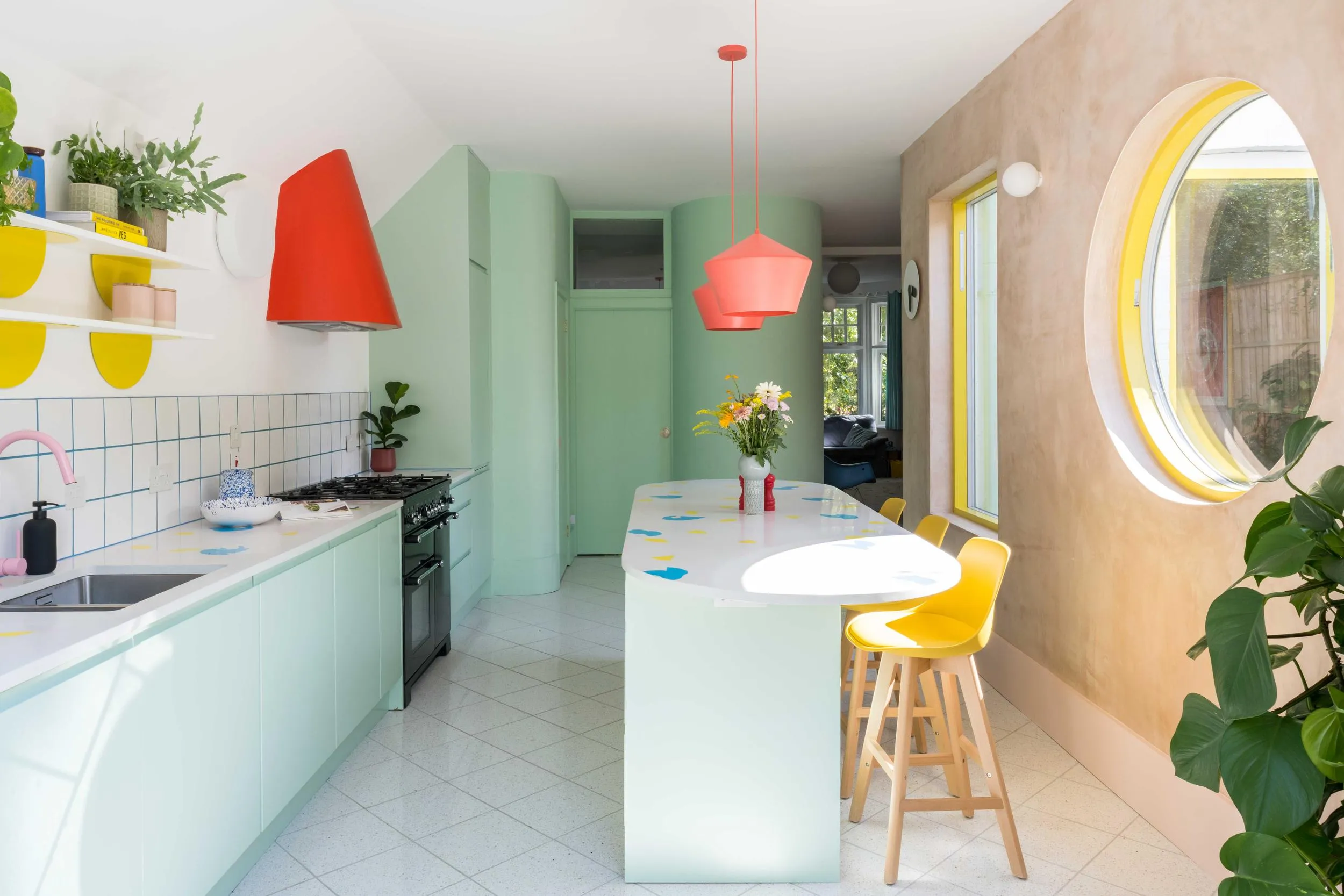
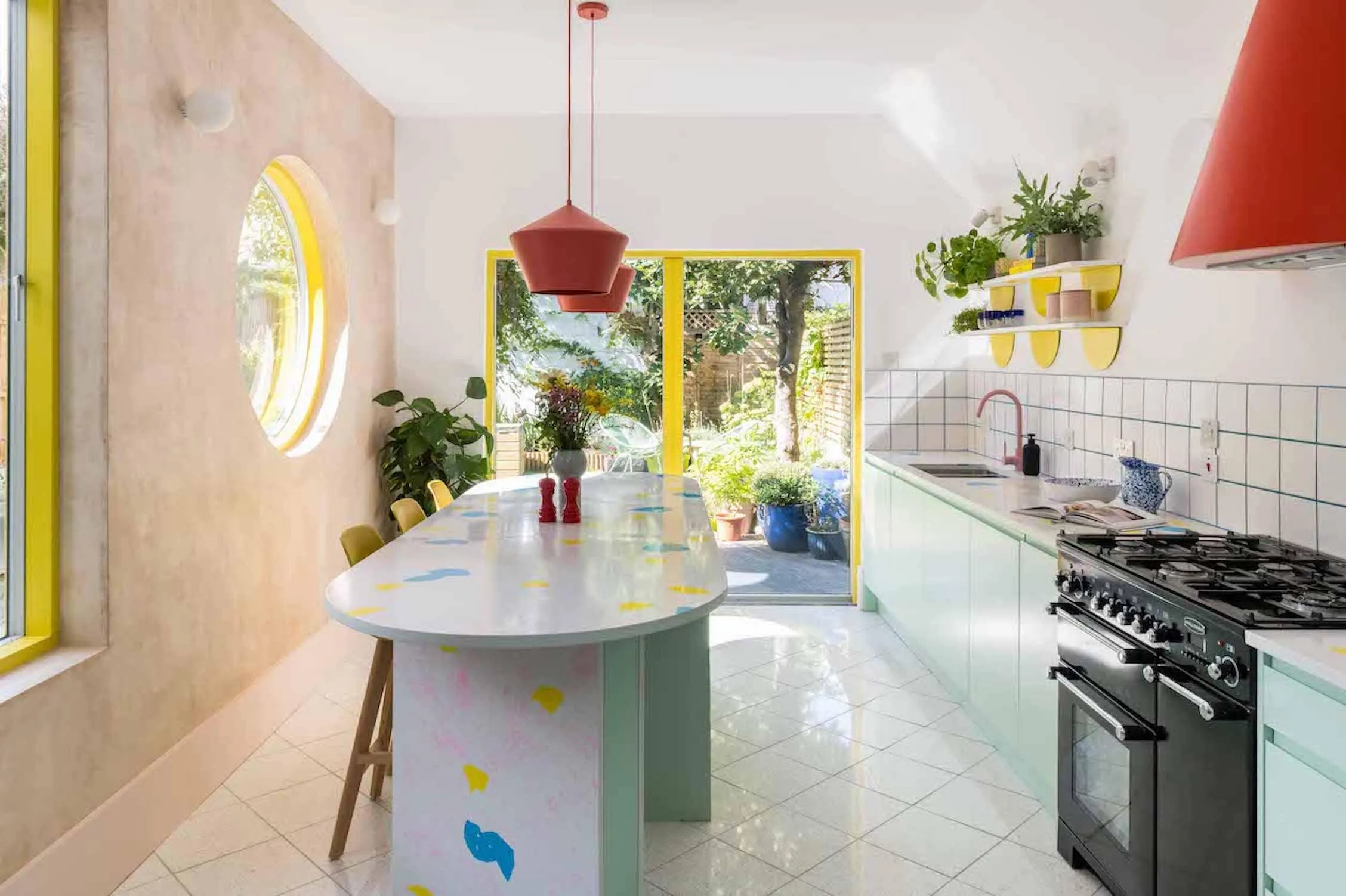
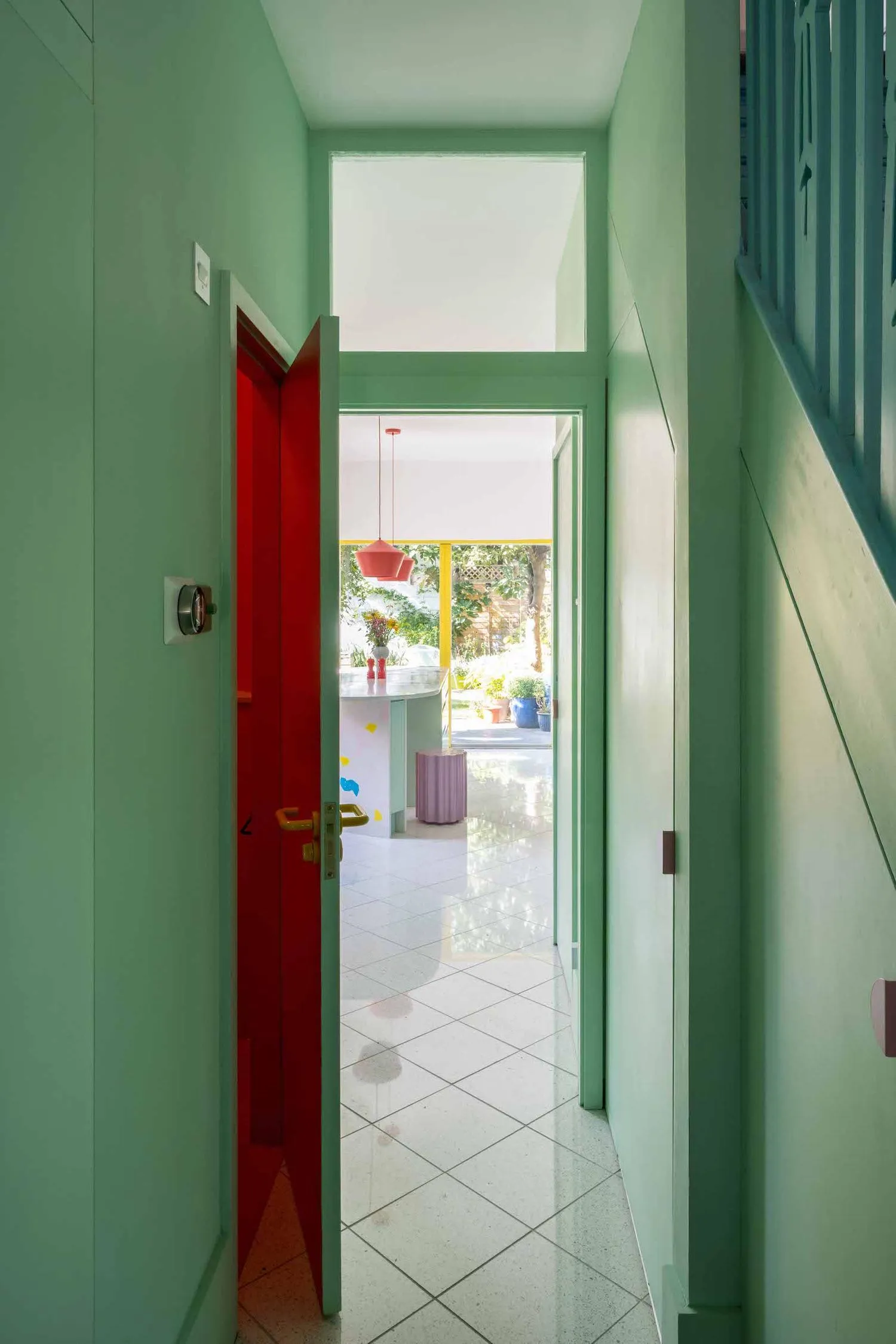
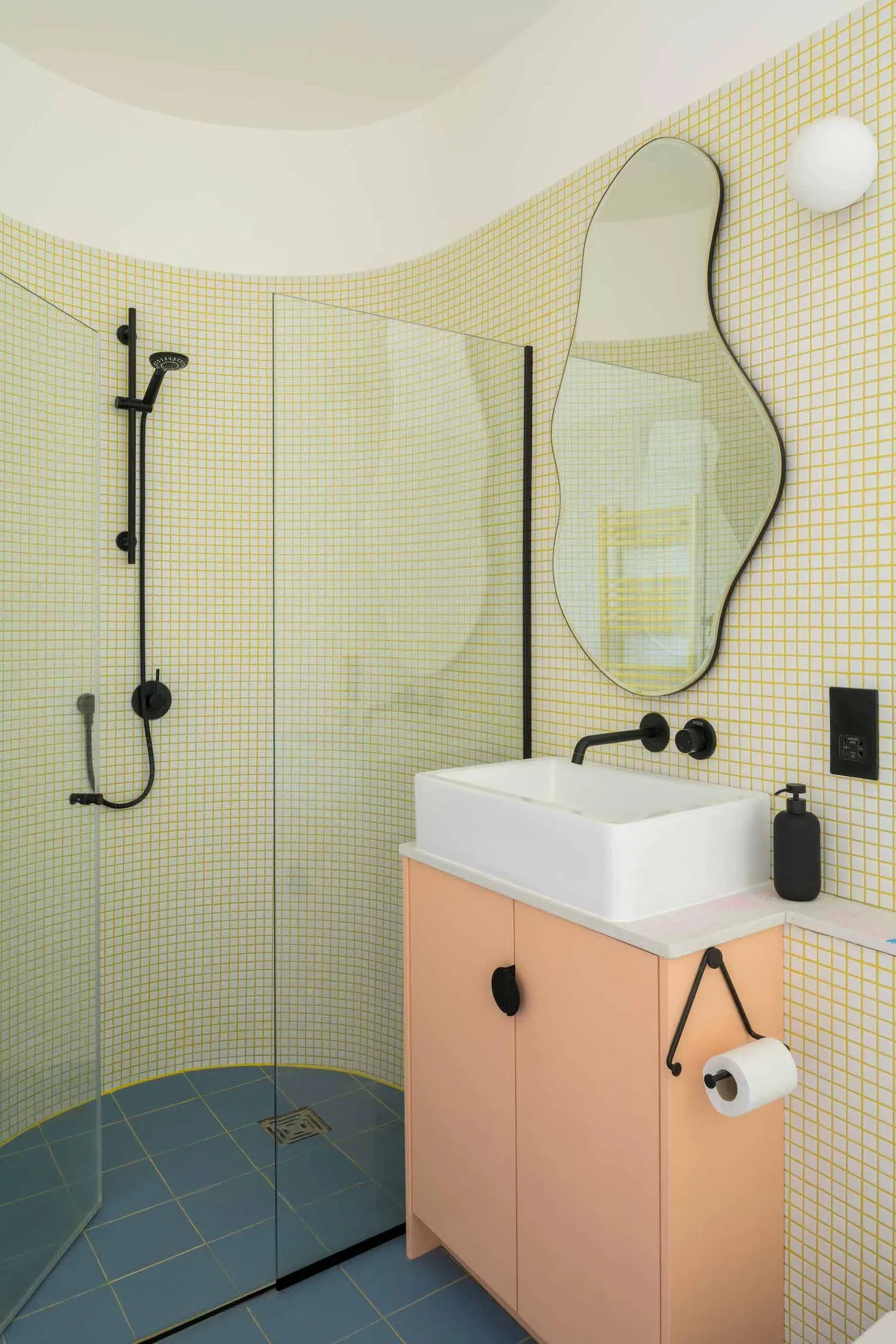
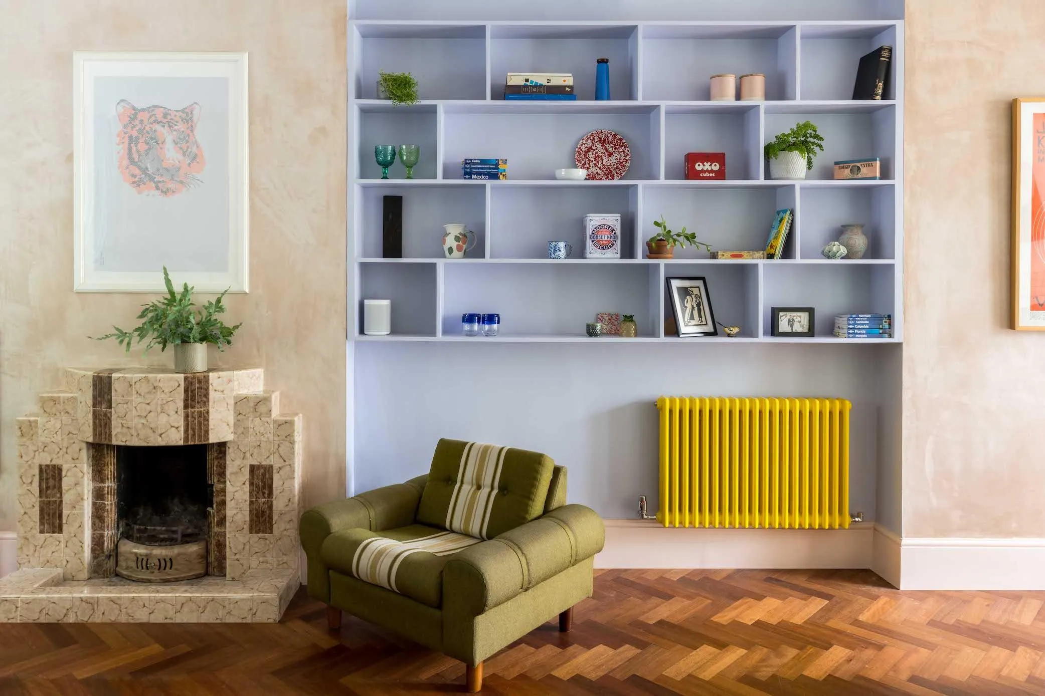
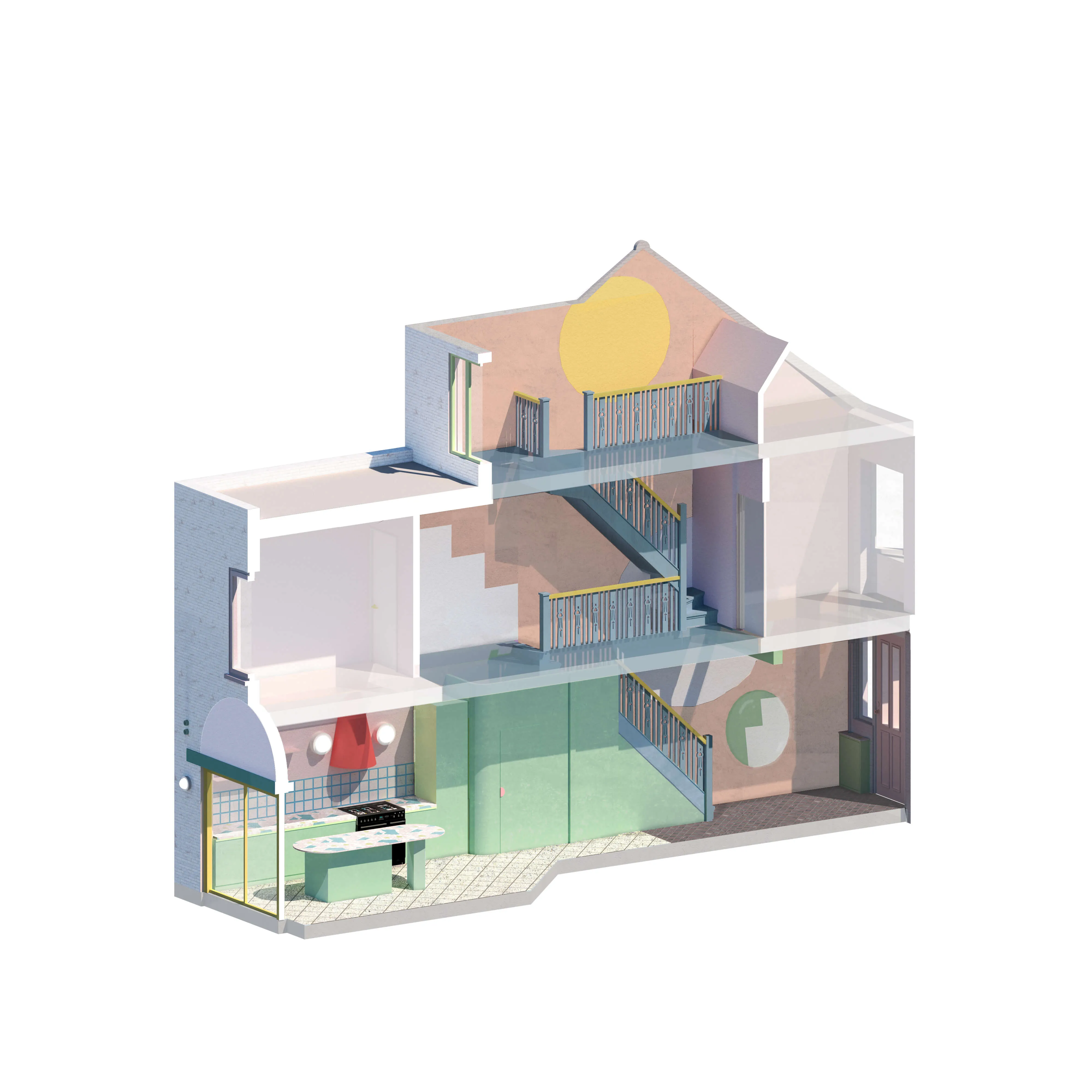
A variety of colours have been used to help define key moments throughout the house and tell a story about the building’s purpose and history. For instance, a minty green is used as a graphic tool to highlight all the new-built elements on the ground floor, wrapping around the curved walls of the toilet, through the kitchen, and on to the rear garden wall. Meanwhile, yellow is used for the window and door frames to highlight the new openings. Where existing walls have been restored, the pink plaster has been left bare, indicating the house’s past and bringing warmth and softness to the space.
As lovers of the outdoors, the family wanted this love of adventure to be captured in their home. We took these ideas and reconfigured the interiors to bring in more light and create a sense of playfulness. A collection of graphic shapes overlap between the different levels of the house, following the stairwell. This includes an over-scaled stair painted on the wall that draws you up, while reflective circular shapes help to connect the different levels while also capturing sunlight entering through a rooflight above and bringing it downstairs.
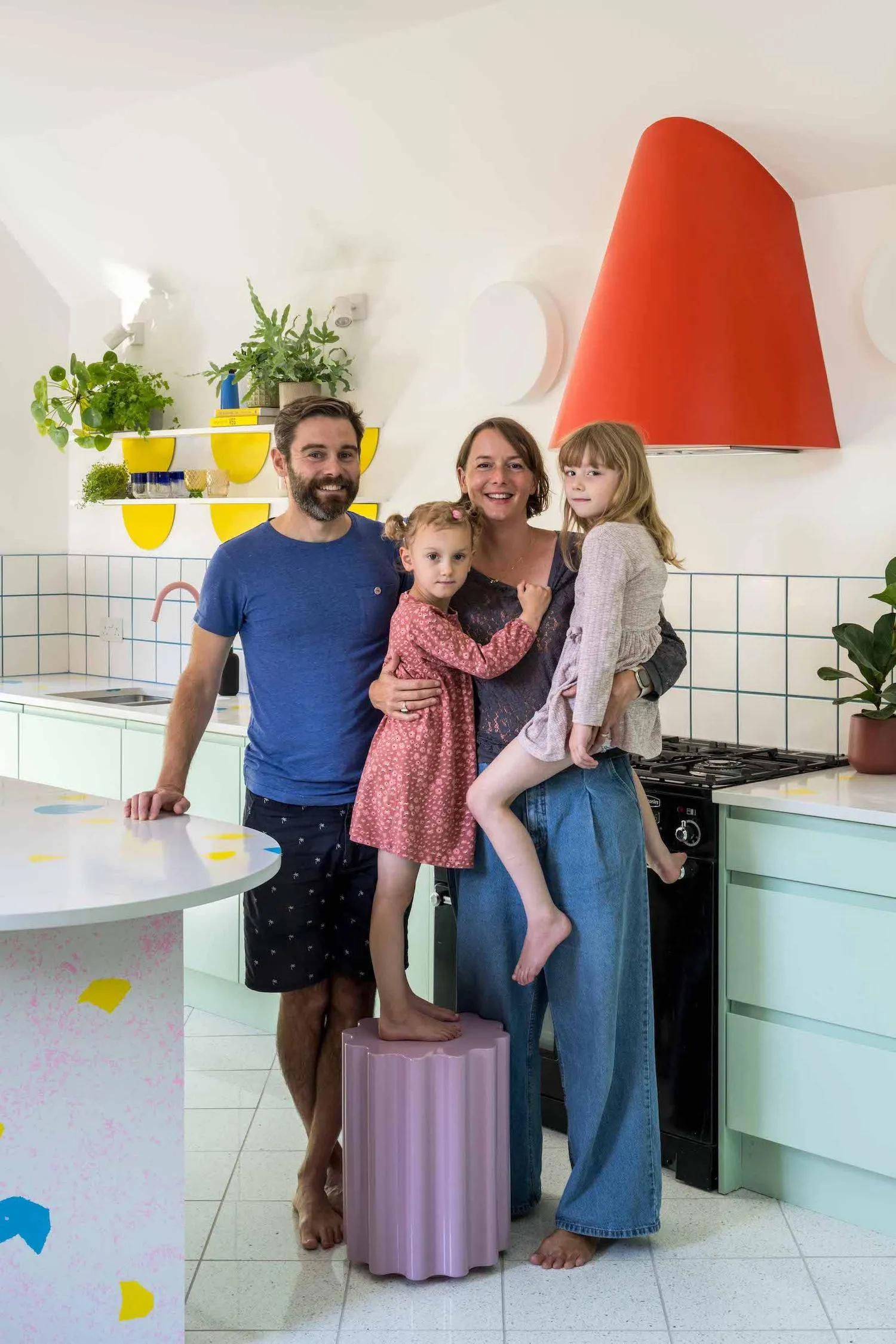
Pops of bright colours highlight objects and elements in the space, such as a red curved extractor hood that projects like a nose from the wall in the kitchen, marking the cooking space. The interiors of the toilet and coat cupboards are painted in a bright Dulux Bongo Jazz, a vivid peach, creating an immersive colour experience that contrasts with the minty green. When the doors are ajar, the colour spills out into the hallway, creating intrigue and surprise.


‘If there were more stars we'd give them! We are delighted with the result, which has transformed our space into a happy, usable, fun place to live. We are so happy we found them, that they chose to work for us, and that we get to live in the result for years to come. :)‘
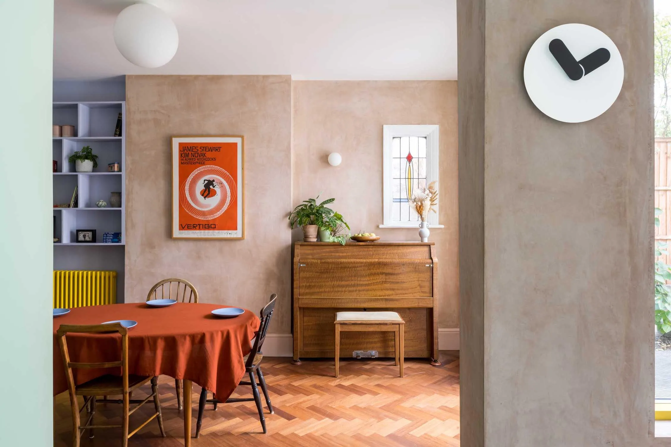
Throughout the house, circular shapes have been used to puncture walls. Some are transparent, allowing light through, as with the large window in the kitchen, while others mirror and reflect light. In the stairwell, the circular mirrors and glossy paint reflect light and create new views and graphic compositions which play out as one moves through the space. The kitchen window also acts as a time marker, like the oculus in the dome of the Pantheon in Rome. The circle of sunlight will track across the space, recording the passing of time and the seasons. When the circle first appears, it announces the beginning of spring, and its disappearance marks the start of winter.
The homeowners loved the curved edges in the brick walls and the later addition of the Art Deco fireplace in the original house, and wanted to see these reflected in the designs. These features are echoed in the round windows and mirrors, the rounded worktops and curved walls. The graphics serve a practical purpose as well as an aesthetic one, the curved walls of the WC lead you through the hall, kitchen and dining space.
Creating a long-term home which is better insulated, well ventilated and more sustainable, was important to the family. Insulation has been added, and wherever possible the house has been repaired and restored, rather than building new. The kitchen worktops were made from recycled plastic cutlery melted down to create hardwearing kitchen surfaces.
To read in more detail about how we transform the homes of our residential clients, click here.


Details
Location: Hackney, London
Project: Residential refurbishment
Client: Bronwen and Spedding
Completed: 2022
Team
Online
Dezeen
Dezeen (Don’t Move Shortlist)
Enki
Archinect
Wallpaper*
Architecture Today
Dwell